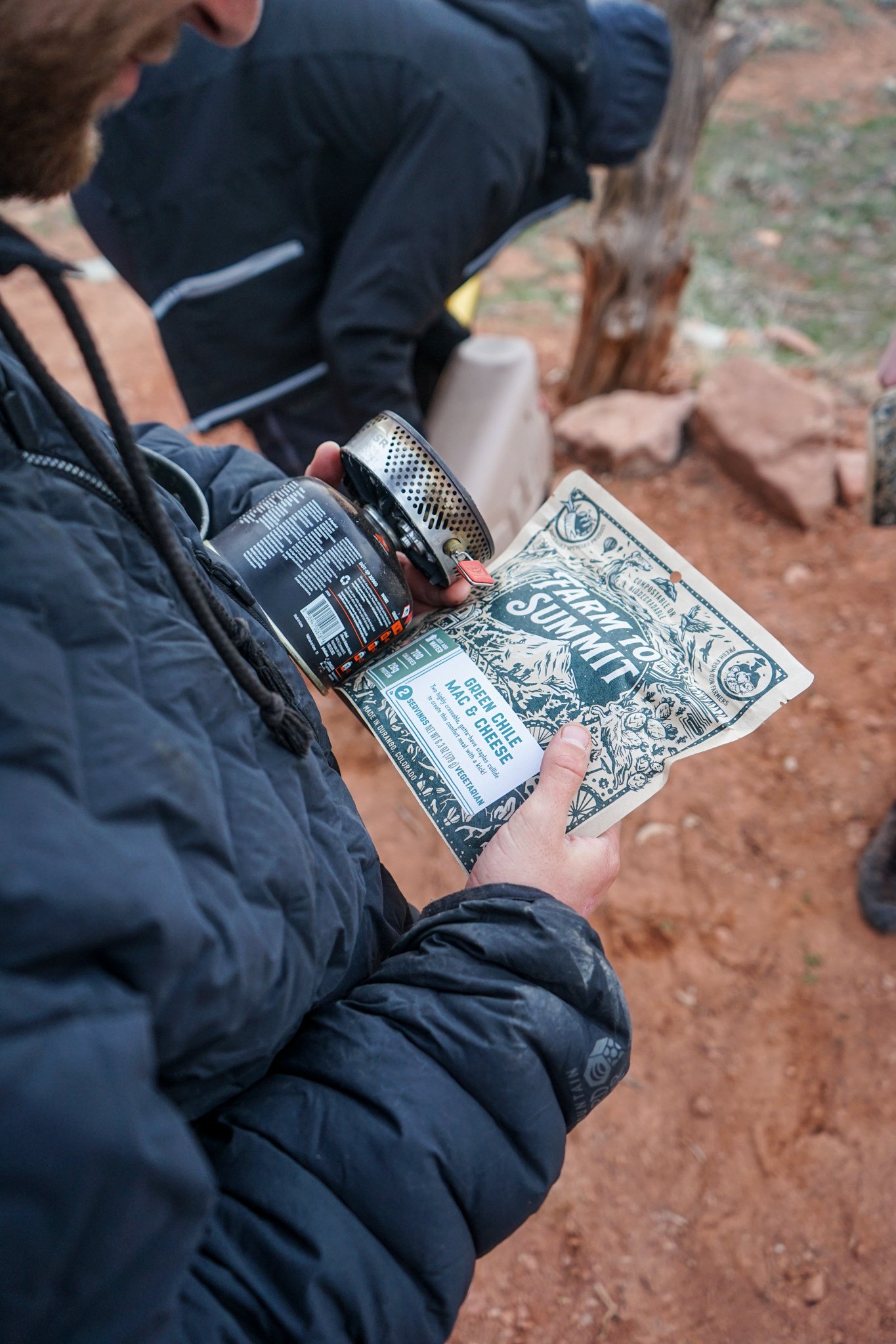
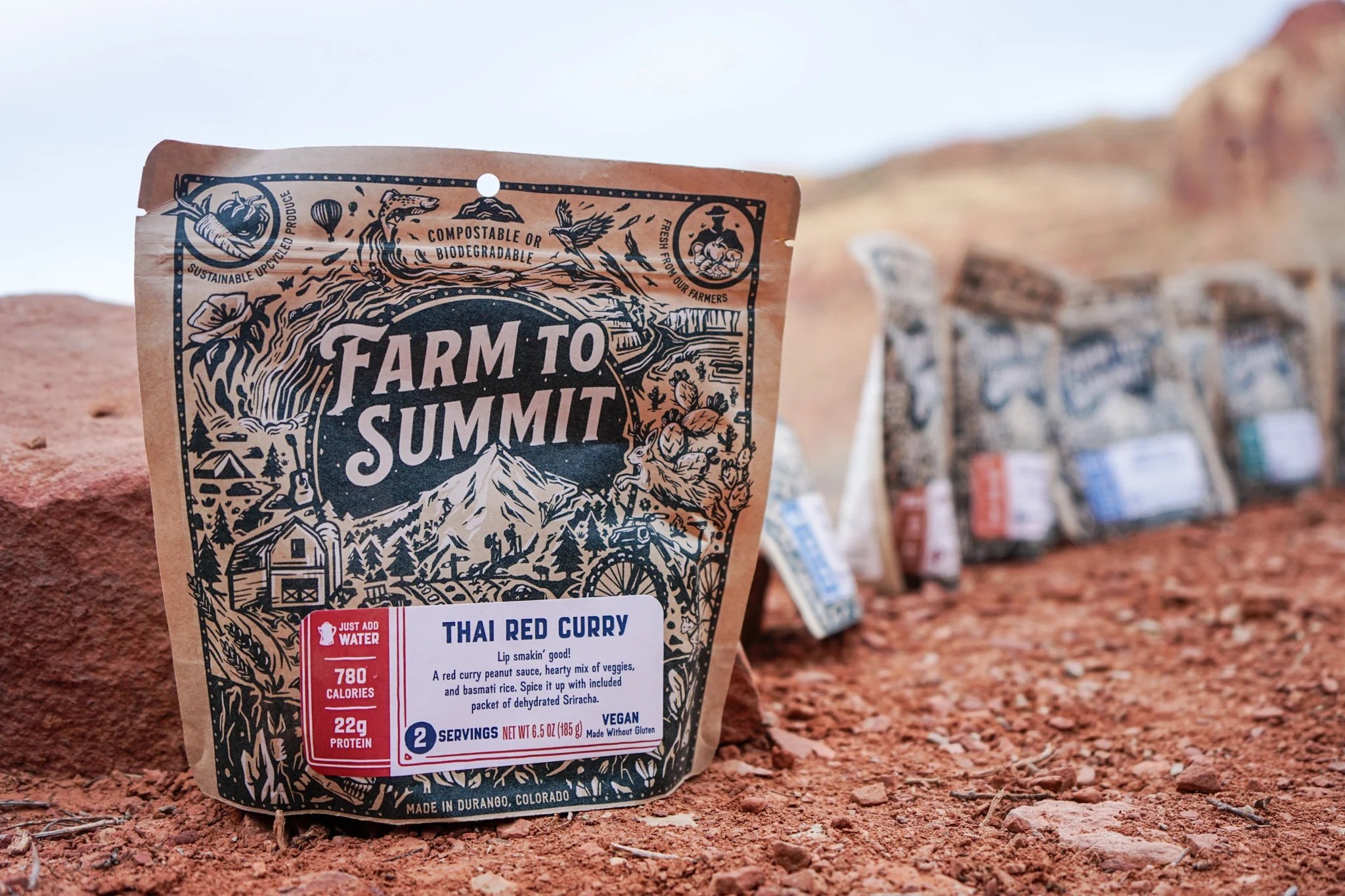
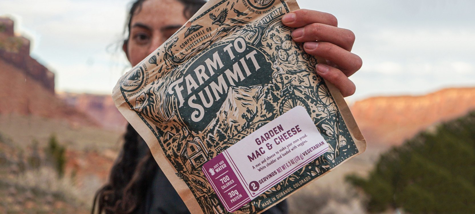
Farm to Summit
Packaging redesign for Farm to Summit, a sustainably produced and packaged dehydrated food company that is women owned and uses farm fresh and upcycled ingredients. Created illustrations which depict a visual journey from farm fields to a mountain summit including environments that surreally transition from one to the next as well as lots of animals and hidden adventurous moments.
I did not execute the logo type and badge layout/type
Evolution
The far left of the image was our client’s starting packaging. They wanted to keep some elements similar like the logo and the idea of the farm and the summit in the illustration but we had a lot of freedom otherwise to approach this project as we wished.
In the first approach I used an etching style almost playing off what they had originally and although it was liked a lot we ultimately decided it was a bit too delicate.
That led us to the next and final style which is more of a blocky bold wood cut approach. This helped it stand out from further away and felt right for the rugged outdoors while still having all the fun hidden details.
Illustration Analysis
01 Example of scenes flowing from one to the next and having creative interactions to make this flow exciting and slightly surreal.
02 Integrated type further into the illustration and was able to have the word summit interact with the drawing of the summit adding depth overall.
03 The illustration breaks the border creating dynamic asymmetrical moments.
04 Wanted a nod to the two creators of this product Jane and Louise as well as to appeal to hikers/adventurers.
05 Important to include the barn because farm fresh is a big aspect of this product and it will be recognized in the logo.
06 An example of small easter eggs throughout the illustration, the scene shifts underground here and so wanted to hide a small mouse.
07 This is what hides underneath the sticker label should one ever peel it off. There’s a slightly more fantastic edge here with dinosaur bones and crystals along with some customized type with tagline “Packed with purpose”.
Illustration
Farm to Summit provides dehydrated meals for adventurers in the backcountry while also using sustainable packaging, sourcing from local farms and using upcycled produce.
The illustration is focussed on the outdoors as well as the journey from farm to summit evoking a sense of adventure, vitality and endless possibilities.
A series of outdoors scenes and animals flow from one environment into the next taking your eyes in loops around the bag finding a new hidden detail each time around.
The initial ✨napkin scribble✨ to the final with many (more refined) sketches and versions in between
Logo Design
Worked on two different logo illustrations, used a thick blocky style that reads well from a distance and matches the style of the main packaging. They vary slightly as the left is more organic with rough edges and hugs the words whereas the one on the right is more contained within a shape and a bit simpler.
Fitting the Dielines
The illustration needed to be customized depending on the size and shape of the packaging, each had its own unique dieline. There are added illustrations to the larger bag to fill the additional empty space created whereas for the coffee box the illustration was completely reformatted to fit its layout and shape.

pc @peakwes

pc @peakwes
